New Concepts

New Concepts

  • عالی

    رای: 126 62.4%
  • خوب

    رای: 56 27.7%
  • متوسط

    رای: 13 6.4%
  • بد

    رای: 7 3.5%

  • مجموع رای دهندگان
    202
  • نظرسنجی بسته .

کدخدا

مدیر بازنشسته
Vital Building by Mozas+Aguirre

Vital Building by Mozas+Aguirre

Vital Building by Mozas+Aguirre

Vital Building, Vitoria-Gasteiz, Spain by Mozas+Aguirre Arquitectos
images: Cesar San Millan
These are the headquarters for the local savings bank. The idea is to identify the building as a live organism in motion. A black skin made of glass protects the inhabited spaces behind the stainless steel pairs. Created by Mozas+Aguirre Arquitectos, the building has a chromosome-shaped floor, with four arms. The structural concept is based on pairs of exterior metal supports, clad in stainless steel composite panels. One of the arms has been conceived as a 26-metre cantilever. In this case the concept changes and the pairs do not have any structural function.
The hall in the heart of the building has two facades, enclosed by a work of art. They have been constructed with bright red polyurethane panels with manually painted biological pattern.
 

کدخدا

مدیر بازنشسته
imes Hotel by Alexander Lotersztain


July 11th, 2008

The Limes Hotel by Argentinian designer Alexander Lotersztainopened at the end of last month in Brisbane, Australia.

The hotel incorporates a roof-top bar and cinema and is the first Australian hotel to join the Design Hotels organisation.

Here's some info from the hotel:

First Australian member of Design Hotels opens
Designed by award-winning designer, Alexander Lotersztain, the first Australian member of Design Hotels, the Limes Hotel, opened June 27 in Brisbane.

Located in Fortitude Valley, the hub of Brisbane's nightlife, also known for its trendy cafes, shops, bars and restaurants, in keeping with this vibrant neighbourhood, Limes has been created to include a completely open air roof top bar and roof top cinema (in hibernation until Spring).

Drawing inspiration from a lifetime of international travel, with countless hours spent in aeroplanes and hotel rooms, Alexander concentrated his design focus on the 21 rooms to cater for the independent traveller, rejecting the 5-star norms and opting to focus on guests' primary travel requirements through unique design solutions in styled lodgings.

"Attention to detail is reflected in my design choices, which are understated yet buzzing with the contemporary energy of Brisbane and the Valley surrounds," Alexander said.

The rooms feature custom Corian (by Dupont) kitchen benches and toilette vanities, Blackbutt timber bed heads, custom powder coat aluminium door handles, splash-back and floating bedside tables, Luna Textiles curtains and bathroom wall tiles by Bisazza. Each room has an individually hand painted feature wall created by using a mineral coating technique (Julien Fantone, Idea Creations).

"The Limes concept is an emphasis on the essentials to make a pleasing and at times novel experience, whether staying for a night, a drink, a movie or all of the above," Alexander said.

Where design permitted, mundane items such as rubbish bins and cables are minimised or completely hidden. This not only makes the room look cleaner and visually clearer, but also from a practical aspect, makes the servicing of the room more efficient.

"I wanted to make Limes a design experience, however stripped of the associated design ideals of something unattainable. I shifted the design focus to make the guest feel special, yet not afraid of jumping into the bed like it was their own."
Limes is a stunning yet simple urban retreat, and throughout all facets of the hotel from the rooms to the roof top bar and cinema, Alexander has created a modern and warm atmosphere unencumbered by excessive ornamentation.
"I decided to view the hotel in its absolute entirety – considering the intended look and feel, and paying heavy attention to the interiors, furniture, surfaces and finishes, as well as extending my design influence to Limes' music and drinks list. I went on to give the Limes a "face" by tangibly branding the hotel through its facade – an extension of the Limes logo on a gross scale. By leaving no facet of the hotel to chance, one feels what I can only describe as the "spirit" of Limes when in its presence. A strong feeling within the doors of Limes and a residual impact realised on returning home."


My Best Regards For Ever And For Always
Fantasy is my Architecture\ The Fantasy Become Reality
Arch : M. F. KanFar 
 

کدخدا

مدیر بازنشسته
Seeing the light - SOM's stunning church

Rising from its base in Downtown Oakland SOM's Cathedral of Christ the light forms an admirable curved silhouette contrasting to the square blocks surrounding it

Appearing as a sanctuary in its context as a holy building as well as for architecture, the wooden frame of the inner structure of the Cathedral stands like an upturned ark while the layered structure offers a contemporary sense of solace.
The 2000 year old St Francis de Sales Cathedral was damaged irreparably by the 1989 Lorna Prieta earthquake, but the new Cathedral building presides where this stood updating but retaining the religious message by stripping away the traditional iconography. The approachable result remains open to the region’s ever-changing multi-cultural makeup and to the future.
As its name suggests, the Cathedral draws on the tradition of light as a sacred phenomenon. Through its poetic introduction, indirect daylight ennobles modest materials—primarily wood, glass and concrete. With the exception of evening activities, the Cathedral is lit entirely by daylight to create an extraordinary level of luminosity.
The lightest ecological footprint was SOM’s core design objective. Through the innovative use of renewable materials, the 1500-seat Cathedral minimizes the use of energy and natural resources. The structure’s concrete makes use of industrial waste fly ash, a byproduct of coal production that requires less energy to produce than cement. An advanced version of the ancient Roman technique of thermal inertia maintains the interior climate with mass and radiant heat.
Douglas Fir, obtained through certified harvesting processes, is aesthetically pleasing, economically sound, and structurally forgiving - the wood’s surfaces add warmth while its elasticity allows for the bending and returning of shape during seismic activity. Through the use of advanced seismic techniques, including base isolation, the structure will withstand another 1,000-year earthquake.


کدخدا

مدیر بازنشسته
Container for life
Single-family custom residence utilizing recycled ISO cargo containers.

Container architecture is on the rise – the basic structures offer a simple and environmentally conscious solution to room creation and the competition seems to be underway to use the structures to their best potential. This container-home is one of the latest to utilise this technique, using 8 cargo containers varying in legth. By embracing its humble beginnings to stylish ends, WAN find it worthy of House of the Week status. Christian Kienapfel discusses the Redondo Beach Container Home in its wider context…


The redeployed containers are a critical element of the transportation infrastructure that facilitates global trade and with the ongoing trade imbalance; millions of containers remain in ports around the USA.. Combined with technologies from the neighbouring aerospace industry, the containers have been brought together with a traditional stick frame construction to create a hybrid home. The use of materials and methods from other industries, non-related to residential construction is part of the architect’s philosophical approach.
Airplane hangar doors open the family room to the courtyard where a subterranean cargo container swimming pool is located. The recycled containers, the ceramic based insulation (same that is used on NASA’s Space Shuttle), the prefabricated metal roof panels, the multi-skinned acrylic sheets employed on greenhouses, the formaldehyde free plywood, the tank-less hot water heaters, etc. all add up to a home that is innovative, affordable and environmentally conscious.
The affordability of this building system, in addition to the containers being virtually mold proof, termite proof, fire proof and nearly indestructible, will enable the mass of society to realize the dream of creating a quality custom home at an affordable price. Study the methodologies of Frank Lloyd Wright’s Textile Block homes, Andy Warhol’s Prints, or McDonald’s Hamburgers, and you’ll find that the Architect is simply reinterpreting and re-presenting the best of these processes in a different medium. This project is the torchbearer for a new, more affordable, method of design and construction - Architecture as a Product.


کدخدا

مدیر بازنشسته
House in Somosaguas / A-cero

House in Somosaguas / A-cero

House in Somosaguas / A-cero

The spanish architecture firm A-cero, directed by Joaquin Torres, has built a new house in the Madrid outskirts that synthesizes the evolution of the studio’s signature design language and its technical experimentation over the last years. The house can be aesthetically inscribed in the series of projects made by the studio since its international expansion, in places like the Dominican Republic and Dubai, presenting a greater spatial complexity and and use of shapes that underlines the relation between A-cero’s architecture and contemporary sculpture.​
At first impression the house clearly shows its intentions, with the dominance of stylized curves and bold shapes that relate harmonically to its natural context while keeping a clearly modern character. The horizontal shapes pile up one on another, creating a stratified building that seems to emerge from the earth like a natural formation, the façades are treated with a texturized dark concrete, completing the mineral analogy.

In this capacity of being at once natural in its matter and artificial in its forms, the house reminds of the work of minimalist sculptors like David Nash, or a piece of land art.
The interior contains a varied program, solved with a very complex array of spaces with different heights and levels, as well as the particular shape of some of the rooms. The lower level contains the main hall -covered by a curved ceiling that accentuates its relevance-, living and dining rooms, master bedroom, gym, interior pool, kitchen and service areas. On the upper level is located a painting studio, under a long curved ceiling, flooded with natural light and the best views over the surrounding landscape. The basement is dedicated to health and leisure, with a bar, games room, chill out, massage room, projection room, cellar and gym.

The spaces are freed of columns and other elements that would alter its fluidity and openness, light materials have been used in the interior design to improve this aspect. The floors are covered with large format white ceramic tiles and the bathrooms are finished in white aluminum.


ground plan​
 

کدخدا

مدیر بازنشسته
EMPAC's new art headquarters complete

EMPAC's new art headquarters complete

EMPAC's new art headquarters complete
Technological adaptability creates ideal performance and research spaces

The Rensselaer Polytechnic Institute will soon open the doors to its € 131 million Experimental Media and Arts Center (EMPAC) conceived by Grimshaw Architects.
Located on the edge of the Rensselaer campus the new facility is anchored to the side of a challenging 45-degree hill overlooking the city of Troy. The multi-disciplinary center offers an ambitious, international artistic program providing opportunities for interaction and exchange between artists and researchers in science and technology.
The architects challenge was to combine, in one building, the permanence of the traditional performing arts with the transient character of experimental media.
As one of their starting points, Grimshaw Architects considered the resonant chambers of stringed instruments, in the belief that tradition and experimentation are linked by the unvarying physics of sound. As many as two dozen spaces in the building, all built to first-class acoustic standards, may be in use simultaneously. To allow this to happen without acoustic interference, the major venues are distributed in a cascading arrangement on the site to increase isolation and are constructed with separate foundations, complex independent superstructures and resilient isolation.
Visitors enter the building at the top of the hill and enter the lobby. From this space, a series of bridges cross over a three-storey atrium and pierce into the cedar “hull” that houses the concert hall. Two stairways descend on either side of this space and lead to the theater and two black box spaces that can be used for scientific research and performances.
EMPAC’s innovative features include technological methods never used before in the United States such as a glass curtain wall, featuring mullions that carry heated water to insulate the space from sharp winters. The HVAC system, virtually silent to preserve the integrity of performances and research, uses displacement ventilation to push air through registers under the seats. The centre benefits from more than 8000 inputs and hardwiring to CCNI, the world’s largest university- based supercomputer.
The state of the art centre comprises of a 1,200 seat concert hall, a 400 seat theater, 2 flexible seating studios and 4 artist-in-residence studios. EMPAC will open its doors to the public in October a grand opening to honor the new facilities.


کدخدا

مدیر بازنشسته
celebration of independence

celebration of independence

celebration of independence

Bicentenary Towers celebrate 200 years of Mexican independence

The 10th International Arquine competition to design two towers to celebrate Mexico’s bicentenary, has been won by Gregorio Vasquez and Manuel Wedeles with their designs for Tezozomoc and Xochimilco. The two mixed-use towers - intended to be completed for the bicentenary celebrations in 2010 – will be set in two strategic areas of Mexico City; the Azcapotzalco Technology Park and the Xochimilco Ecology Park. Each tower will be 83 stories, with around 100,000 metres of floor space, and will include offices, residential apartments, a hotel, and retail areas, separated from one another by a sky garden and connected with vertical voids.
The Serpiente Emplumada Tower (Tezozomoc) is shaped by two ellipses, which intercept each other at their core. These ellipses extrude and twist separately, one slightly and the other dramatically, generating moments where the two shapes intersect and complement one another. The outer shell of Tezozomoc creates an interior vertical void where air can circulate and be cleaned up by various layers of air filters. The Piramide del Sol Tower (Xochimilco) extends geometrically from a square at its base, and is shaped by four extruding squares twisted on their vertical axis, to a rectangular tower at the top, the axis of which marks the direction of the sun. As with Tezozomoc, these twisting volumes generate vertical voids that are used as air ducts where air can be filtered and cleaned, and recycled back into the atmosphere.
Vasquez and Wedeles Architects not only designed the towers to reflect the technological and ecological aims of the competition – with the buildings acting as air filters for their respective parks - but also to represent the history of Mexico itself, with Tezozomoc referencing the ancient Mayan civilisation and Xochimilco representing the Aztecs.


کدخدا

مدیر بازنشسته
Open for business

Open for business

Open for business
Tour T1 towers over Europe’s largest business district

Designed by French architectural firm Valode and Pistre, the T1 Tower is now complete. Situated in La Défense, the high-rise business district west of Paris, the tower has a floor area of 70,000 sq m and features restaurants, meeting rooms and underground parking to support the office space within.
Valode and Pistre describe the T1 as having been "conceived as a folded glass plate, 200 metres high, cut by an arc on its north face. The distinctive profile changes according to one’s vantage point and assures the tower’s insertion within the surrounding context. Seen from the south, the tower appears as a ship’s bow, a vertical element and a complement to the skyline of the La Défense business district. Seen from the east and west, T1 is perceived as a large sail, its curving form providing transition to the lower scale of the adjoining neighbourhood. The image given by the north façade is one of a tall staircase, climbing to the sky and disappearing as the façade curves out of view. The tower’s configuration allows for large floor plates and panoramic views, associating spatial quality, efficiency and the latest building services.”
Tour T1 is part of La Défense's once again expanding business quarter, which is now the largest purpose-built business district in Europe.


کدخدا

مدیر بازنشسته
Nakheel Harbour & Tower by Woods Bagot

Nakheel Harbour & Tower by Woods Bagot

Nakheel Harbour & Tower by Woods Bagot

October 6th, 2008

Architects Woods Bagot have designed a kilometre-high tower for developer Nakheel in Dubai.

The tower, unveiled at the Cityscape real estate fair in Dubai, will be the world’s tallest building and is part of a development that also includes “the world’s first inner city harbour”.

The following information is from Nakheel:

Includes tower more than a kilometre high and the world’s first inner city harbour
Dubai, October 5th, 2008
Inspired by Islamic design and geometry, master developer Nakheel announced today that it is building Dubai’s capital, Nakheel Harbour & Tower. The new community was launched at a VIP event hosted by His Excellency Sultan Ahmed bin Sulayem, Chairman of Dubai World.

At the core of the Nakheel Harbour & Tower development is a tower more than a kilometre high and the world’s only inner city harbour. The development will cover an area of more than 270 hectares and become home to more than 55,000 people, a workplace for 45,000 more and attract millions of visitors each year.

“There is nothing like it in Dubai”, His Excellency Sultan Ahmed bin Sulayem said at the launch. “Nakheel Harbour & Tower is located in the heart of ‘new Dubai’, where we have focused on creating a true community, a location for living, working, relaxing and entertaining, for art and culture. All of this is concentrated in one area.”

In line with Nakheel’s role in shaping Dubai’s future and creating some of the world’s most iconic developments, Nakheel Harbour & Tower incorporates elements from great Islamic cities of the past - the gardens of Alhambra in Spain, the harbour of Alexandria in Egypt, the promenade of Tangier in Morocco and the bridges of Isfahan in Iran.

“With Islamic influences governing its design, Nakheel Tower has been able to reach its height of more than a kilometre. This inspired approach has enabled us to achieve a number of amazing feats of engineering, for example the Tower will be the world’s tallest concrete structure,” said His Excellency.
Nakheel Tower will have four individual towers within a single structure – a groundbreaking engineering feat. A distinctive crescent-shaped podium encircles the base and complements its remarkable height.
“Nakheel has sought inspiration not just from Islamic design but also from the Islamic principles of inclusion, innovation, diversity, excellence, growth and progress. These are the same principles that have motivated and guided Islamic culture and helped create its great cities throughout history. Now they are shaping the cities of the future,” enthused His Excellency Sultan Bin Sulayem.
Not only has a development of this shape and scale not been attempted before, but it is also a further example of Nakheel’s innovative projects that have changed the way the world looks at Dubai.
The multibillion dollar Nakheel Harbour & Tower development will include 250,000m2 of hotels and hospitality space, 100,000 m2 of retail space and huge expanses of green spaces including canal walks, parks and landscaping. The new development is geographically central to the Emirate of Dubai, at the intersection of Sheikh Zayed Road and the Arabian Canal; and will also complement Nakheel’s surrounding developments including Jumeirah Park, Jumeirah Islands, Discovery Gardens and Ibn Battuta shopping mall.
The Nakheel Harbour & Tower development minimises car use and maximises train, bus and water transportation. A complete transportation hub blends into the harbour area with metro transportation combined with a unique water transport interchange, with Abra & Dhow station links.
Sustainability and safety will be key to the planning and design of Nakheel Harbour & Tower, with the latest standards and technology incorporated in the development.
“The inspiration for the project came from Sheikh Mohammed’s vision for building for tomorrow,” said His Excellency. “He is famously quoted as saying that ‘before evaluating the future, we have to take a quick look at the past. For it is the foundation of tomorrow’.
“It sends another message to the world that Dubai has a vision like no other place on earth.”


کدخدا

مدیر بازنشسته
Lace Apartments by Ofis Arhitekti

Lace Apartments by Ofis Arhitekti

Lace Apartments by Ofis Arhitekti

September 23rd, 2008

Slovenian architects Ofis have completed an apartment block in the centre of Nova Gorica, Slovenia.

The facade is composed of a 3D “lace” pattern that generates elements such as balconies, terraces and pergolas.

Photographs are by Tomaz Gregoric.

The following information is from Ofis Arhitekti:

Lace apartments
The location of the apartment block is in the centre of Nova Gorica (population 32.000) – Nova Gorica is situated in the west of Slovenia, adjacent the Slovene – Italian border. It lies 92 meters above sea level.

The town has also very specific climate conditions – it is renowned is the hottest town in Slovenia in summer and very strong winds in winter.

The object is positioned on the fixed urban plot 48 x 16m x 5 floors. The formal concept reinstates three-dimensional lace which embraces the volume of the building.

Furthermore, the lace is transformed into functional elements – projecting roofs, pergolas, apartment dividing walls, terraces and balconies with loggias.

These elements are protecting external spaces and interior of apartments and provide additional privacy to inhabitants.
 

کدخدا

مدیر بازنشسته
Flying low at JFK

Flying low at JFK

Flying low at JFK
Gensler’s new Terminal 5 at JFK tailored for a low profile

Providing service to 20 million passengers a year, the new Terminal 5 at New York’s JFK airport maintains a surprisingly low profile. It’s design, while still remarkable and sleek, is “low profile with intent” says Gensler’s Managing Director for this project, Bill Hooper. “This was one of our intentions and also several preservation societies for the area were keen on keeping it as low profile as possible.” But, he advised, this design is offering something new in the world of air travel: “We have designed this to be the first of a new generation of terminals for low cost air traffic.”
The shell of the terminal spreads low and wide covering 635,000 sq ft on 72 acres and with 26 gates and 3 concourses, will be able to cope with up to 250 flights a day.
The interior space is designed to cope with the enormous flow of passengers and the difficulties which this may invoke. “There will be 2 to 3 times more passengers, per year, per gate flowing through this one terminal than any other terminal that we have seen,” said Hooper. “We had to avoid any ‘snags’, as we might call them, in the flow of passengers to the normal or smooth operation of things.” This meant that particular attention had to be paid to the sizing of the sidewalks, spacing in the ticket halls and allowing space for clear signage.
The sheer volume of passengers as well as the terminal’s location and purpose meant that considerations for post 9/11 travel were also high on the agenda. One of the first U.S. terminals to be fully designed and built post 9/11, the JetBlue terminal is designed for the way people travel today. For example, a 225 ft long bench is arranged at security to allow people to sort their belongings and shoes which prevents a bottleneck situation and helps to reduce stress. Soft rubber flooring is also used in this area to make for a more comfortable bare-foot experience.
A strategic use of natural light includes T5's glazed landslide façade, abundant glazing and light monitors in the concourses, clearstories in the ticket hall and marketplace and an open light shaft connecting the first departures level with the baggage area below. This provides not only a nod to ambiance, but also to sustainability, reducing the volume of energy necessary to light the space.
The terminal, which opens on 1 October came with a $743 million price tag for which the Port Authority of New York were billed the majority with $80 million provided by JetBlue, the flight company who will operate from the terminal. This investment shows that while the design is understated, the facility is of strategic importance to the city of New York which saw 46 million international and domestic visitors last year alone.


کدخدا

مدیر بازنشسته
RMJM's Russian tower houses 'hanging' garden

RMJM's Russian tower houses 'hanging' garden

RMJM's Russian tower houses 'hanging' garden

27 June, 2008​
RMJM has unveiled exclusive images of a proposed tower building in Ekaterinburg, Russia’s third largest city, which houses a vertical ‘hanging’ garden – believed to be the only one of its kind in the world.​
Speaking last week at a Pan-European conference on green construction in Berlin last week, Matt Cartwright, a director of RMJM’s London office, said:​
“Tall buildings will play an important role in the future of modern cities and the focus for all cities, including London, should be on making these buildings environmentally sustainable so we preserve the environment, conserve energy and provide healthy working and living spaces.”​
He added: “Building tall can mean a smaller building footprint, allowing for more space for the parks, rivers and green public space that are vital for a city."​
Inspired by the city’s heritage and developed for the Red Group, the tower has a contemporary vertical evergreen park running through the core of the building demonstrating that tall buildings also provide an opportunity to create new green public space for a city.​
The Ekaterinburg tower is designed for the enjoyment of the general public, as well as those who work in the building. The firm’s design solution was developed in response to the extreme climate in the country. The vertical park is topped by a public sky park at the building’s pinnacle offering panoramic views of the city​


کدخدا

مدیر بازنشسته


Benson & Forsyth’s £80m City North scheme to tower over Finsbury Park

28 June 2008​
Benson & Forsyth has revealed its £80 million City North project in London’s Finsbury Park, a mixed-use development of apartments, retail and leisure facilities.​
The practice was selected for the 46,000sq m scheme in an RIBA competition ahead of John McAslan & Partners, Panter Hudspith, Flaq and Studio Egret West.​
The project aims to provide a coherent framework for regeneration in the area, including 480 apartments alongside cafés and restaurants, retail units and a leisure facility still to be decided on.​
Practice principal Gordon Benson said the design would be integrated contextually locally and at the citywide level.​
“The chaotic geometry of the nearby railway line has effectively distorted the orthogonal nature of the city grid,” Benson said.​
“Our scheme will reinstate an orthogonal geometry at local level, with bold vertical elements to establish its presence in north London and the wider city context.”​
The project’s “assembly of volumes” is characterised by a podium over two floors, a raised garden overlooking Finsbury Park at second floor level, and above that an assembly of two towers, one cylindrical, one rectilinear.​
“The tall buildings will simultaneously address both the park to the east and the City to the south, and will be an instantly recognisable signature,” said Benson.​
The podium “repairs and extends” the existing urban pattern at ground level, and will integrate a proposed new concourse to Finsbury Park Station.​
A planning application will be submitted early next year.​
 

کدخدا

مدیر بازنشسته
Cultural centre at Bodø, Norway

UK architects Langdon Reis Zahn are one of four joint winners of a competition to design a new library and concert hall at Bodø in Norway.​
The architects, plus joint winners drdh architects, General Architecture and Florian Hultsch, will now go forward to the competition’s second round.​
Langdon Reis Zahn win Open International Design Competition​
They shared the […]​


House V by 3LHD architects

House V is the latest project from Croatian architects 3LHD..​
The family house is situated on a slight hill near to the Medvednica mountain in Zagreb, Croatia.​
Photographs by Damir Fabijanic.​
More Dezeen stories about 3LHD architects:
Sports Hall in Bale, Croatia
Centre Zamet​
The following information is from 3LHD architects:

House V was designed in order to satisfy the needs […]​


Nurai by Studio Dror

New York-based architects Studio Dror have designed residential villas for Nurai, a resort on a natural island off the coast of Abu Dhabi.​
The development will include 31 estates on the shore and 36 villas surrounded by water.​
The following information is from developers Zaya:

Studio Dror design statement - Nurai:
On an island of limited proportions, how […]​


Zaragoza Bridge Pavilion in Zaragoza, Spain

Photographer Luke Hayes has sent us these photos of Zaragoza Bridge Pavilion, a pavilion by Zaha Hadid Architects at Zaragoza Expo 2008 that doubles as a pedestrian bridge across the river Ebro in Zaragoza, Spain.​
The pavilion, and the expo itself, opened this weekend.​
Zaragoza Expo 2008 is dedicated to water and sustainable development.​
Here’s some info from […]​
http://www..dezeen.com/wp-content/uploads/2008/06/zaragoza-12.jpg​


Spacey design for Oslo’s rail station

Space Group to create modern look for Oslo Central Station, Norway​
SPACE GROUP has won the invited competition for the redesign of the Oslo Central Station organised by the developer ROM Eiendom. The ambition of the 2.9 billion Nkr project is to make the station become one of the most modern public transport hubs in Europe.​
The […]​


Kuwait skyscraper takes shape

SOM designed Al Hamra carves a landmark to overlook Kuwait​
SOM’s Al Hamra design for Kuwait’s tallest skyscraper has begun its realisation as, at 34 stories and 161 m high in its construction phase, it is now visible from miles around. Due to rise to 412 m in height, Al Hamra will be the world’s tallest […]​


کدخدا

مدیر بازنشسته
NLA Skywalk by Carmody Groarke


June 26th, 2008

Architects Carmody Groarke will build a 160m raised walkway in Montague Place in London this weekend as part of the London Festival of Architecture.

Called the NLA Sky Walk, the structure will host exhibitions, music and performances from 4-6 July.

More info follows:

NLA Sky Walk - Montague Place, WC1, 4-6 July 2008

A 160m long architectural installation will transform a little-known street behind the British Museum for one weekend in July, hosting exhibitions, talks, walks, open-air theatre, world music, games food and dancing as part of the London Festival of Architecture.
The two day, free street party will be the central feature of the King’s Cross, Bloomsbury, Fitzrovia and Covent Garden Hub, curated by New London Architecture to provide visitors with an insight into the development and possibilities of this special area of central London.
The NLA Sky Walk, designed by Young Architect of the Year Carmody Groarke, will transform Montague Place, WC1 into an exciting cultural space and public part of the city. The installation, rising up to five-metres high, will zigzag across the street providing a new perspective on the Museum and its surroundings, creating a series of public spaces, a dramatic viewing gallery, outdoor exhibition galleries, lawned seating areas and stage designed around an existing London Plane tree.
The installation will play host to architectural exhibitions, open-air theatre performances from RADA, world music from SOAS, family workshops from the team at the British Museum and Mobile Studio and a large scale public picnic celebrating local fresh food and open space from Bohn and Viljoen Architects. It will be a place to eat, relax and enjoy the spectacle of architecture current, planned and temporary.
 

کدخدا

مدیر بازنشسته
Villa Storingavika by Saunders Architecture

October 21st, 2008​
Norwegian architects Saunders Architecture have finished Villa Storingavika, a private residence located on the outskirts of Bergen, Norway.

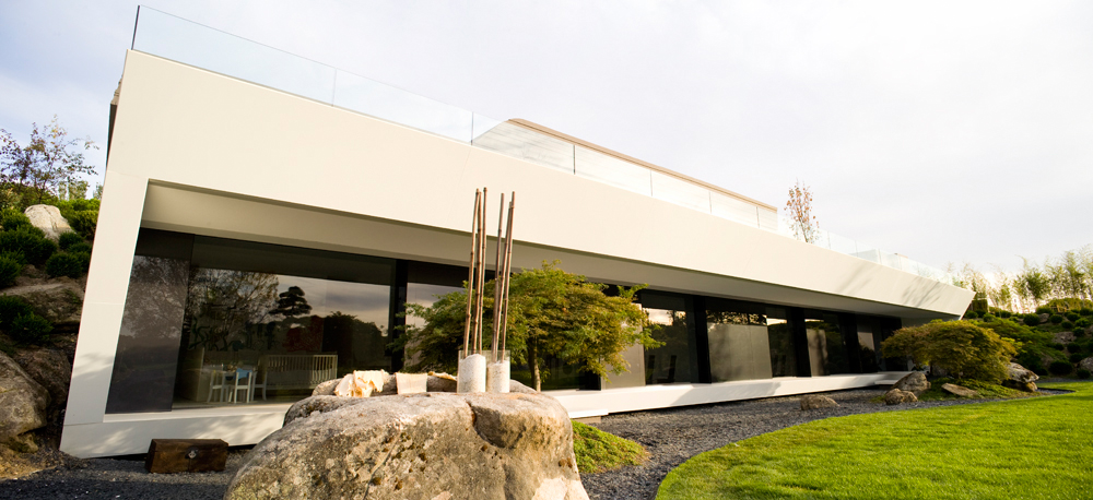
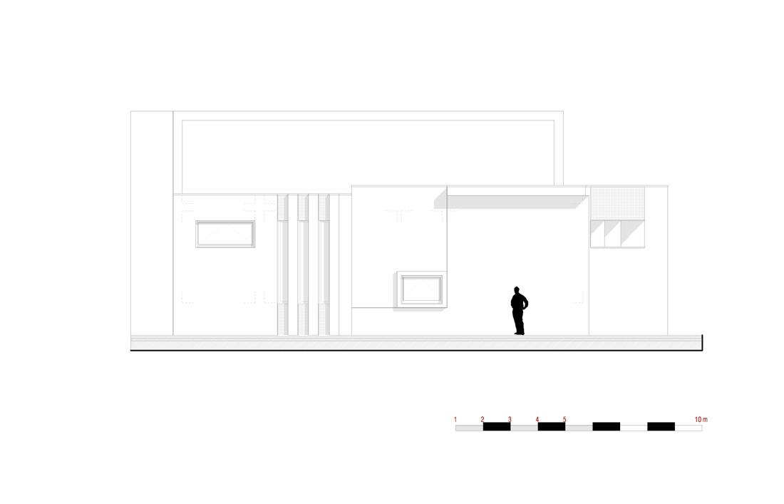
This family dwelling comprises a long thin structure with a projecting balcony at one side, extending 6 metres and supported by three steel columns. Top Photo: Michael Perlmutter. Photo above: Jan Lillebø

Photo: Jan Lillebø. The following is from Todd Saunders:

Villa Storingavika, Bergen, Norway
MAIN TEXT:
Overlooking breathtaking fjords and a stretch of Norway’s west coast archipelago, Villa Storingavika is a robust yet refined vessel from which to appreciate the delicate coastline and sometimes rugged climate. It is a pale timber volume enrobed in a crisp, ‘pleated’ dark timber exterior.

Photo: Michael Perlmutter
Previously there was a small cottage on the site, and when Eli Bakka and Jan Sem-Olsen acquired the property from Jan’s mother in 2004, they decided to tear it down and build a permanent home for themselves and their two grown children, Ina and Erik. “Ever since Jan was a boy, his family had the land and the cottage, which the family often visited,” recalls Eli. “Because Jan had such strong feelings for the place, we decided to build a new house to live here. It was a very beautiful view, we had the possibility to build, and I had always been interested in design and architecture.”

Photo: Michael Perlmutter
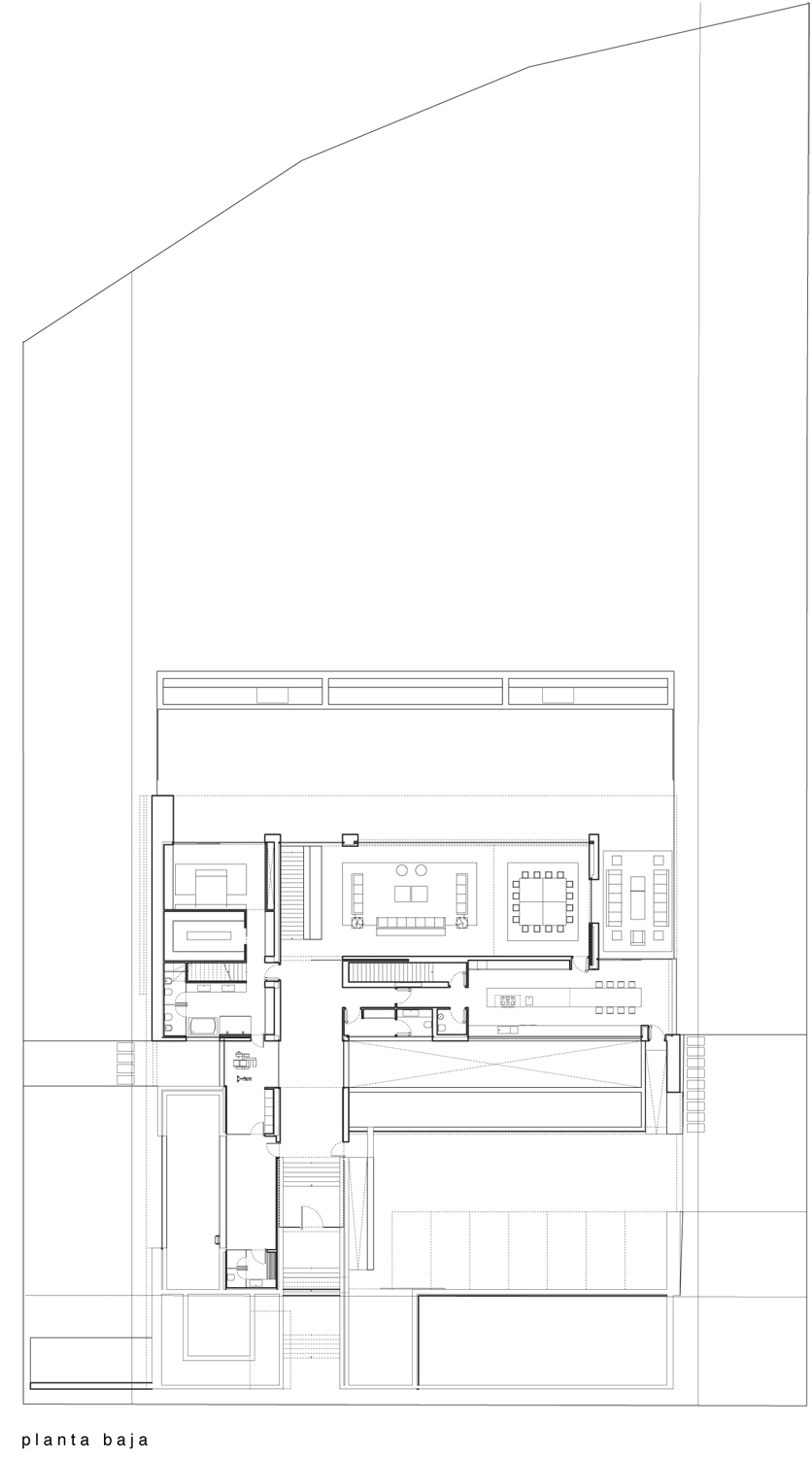
When the owners first approached architect Todd Saunders, they had a clear idea about what they wanted. Their brief called for an upper level with generous open-plan living rooms and a master suite, while a lower level would be used by their children and include a small self-contained apartment. But they were also already thinking about details: “We wanted no trim around doors and windows,” says Eli, “and no baseboards where floor meets walls.”

Photo: Michael Perlmutter
“The process with the client,” Saunders notes, “was in several phases. The first stage, sketch design, was the most intensive with many meetings.” During the workshopping of ideas “there are always lots of variations on the same theme, and there are a few principles you want to attain in this process.” One key principle that emerged was to create a “covered outdoor space,” and another that the client wanted to “wake up in the morning and see the ocean.” “We worked really tightly together” he recalls. “The house has to match with the personality of the client. At the end of the process, the client and architect are both so in ‘tune’ that the client is as focussed as the architect to get the building built to the highest standard.” Jan agrees: “What we liked about working with Todd is that he really listened to us.”

At the outset of his career, architect Todd Saunders left Canada for Norway where he has worked for much of the past decade in Bergen. Since then he has developed his repertoire from modest residences and cabins to notable landscape projects like the Aurland Lookout, for which he and collaborating architect Tommie Wilhelmsen have received international acclaim. Photo above: Jan Lillebø

Photo: Michael Perlmutter
The site of Villa Storingavika, located on the outskirts of Bergen, comprises a rocky outcrop and garden but is essentially a rather compact area. “My primary aim,” Saunders recalls, “was to create more open space than the site first offered by reclaiming as much outdoor space as possible”. The house is oriented along the contours of the site and concrete stairs link an upper outdoor terrace with a lower lawn, utilising all of the natural terrain. This also minimises the impact of the house on the topography. Built-in concrete furniture is also integrated into the site, increasing the use of the lower terrace as an extension of the interior space.

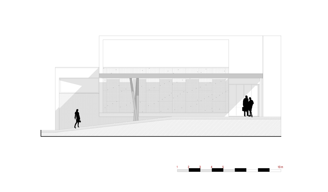
Unlike some of Saunders’ other houses whose plinths lightly hover above the ground, this house is well-grounded in the terrain. On both storeys, the utility and service rooms are located along the northern side of the house, while the living areas open out to the south and the view to the sea. As a consequence, there are very few punctures on the northern side, and large floor-to-ceiling windows face the south. Emerging from the landscape-bound volume of the house is a lightweight wing of space; a six metre long cantilevered balcony. “We were experimenting with different room heights” says Saunders. “They vary from the lofty balcony ceiling to a level just above a low six metre long window where the space is most compressed.” The height of the outdoor room, the tallest section of the house, signifies its importance in the scheme. Notably, the exterior ceiling timber continues into the house in the lounge room where the ceiling height is as tall as the balcony. The balcony is pierced by three circular steel columns that are ‘threaded’ from the ground to the roof.

As a work of architecture, Villa Storingavika is a textbook example of a regional modernism, combining the modern gesture of wide spanning platforms of space with the traditional forms and materials of Bergen’s light-framed timber houses. The building’s proportions are also akin to Bergen’s maritime architecture and its long history of two-storey timber buildings. Translating this established building approach to a restrained, contemporary volume links the house to its context, and ties it indelibly to the site.

The house departs from pure tradition though, and is both experimental and inventive. A deep 60cm folding edge separates the house from the outside space, and as it snakes up and around the façade creates a deep shadow that defines the strong graphical composition. This volumetric depth also creates a zone that interlocks internal and external space. As Eli notes, the outward extension created by the folding edge and the outdoor balcony rooms “makes the house look bigger than it actually is.”

In its composition, the building relates to the outcrops of coastline that it frames. Metaphorically, the house could be compared to the eroded outcrops of rocks it overlooks, with its cantilevered ledges and deep reveals and apertures. It has a sense of permanence that grounds it to the landscape.

Interaction with the view and a poetic transition from inside to outside lends richness to the stark interior. The rough-sawn weatherboards catch jagged shadows with their tapered profile. Moving inwards, this inky timber layer is then seemingly ‘peeled back’ to reveal the smoother Canadian cedar that is ship-lapped in a shallower profile. This middle layer is the transition to the pearly white interior with its smooth and uninterrupted surfaces that are free of cornices and superfluous trims. It’s an interlocking of volumes in a simple but exciting spatial experience. Stark yet harmonious contrasts in texture and tone of materials give clarity to the architectural ideas.

Three main materials are used in the project: glass, black-stained fir and oiled Canadian cedar. All of the decorative and aesthetic qualities of the building come from the materials themselves and the dimensions of those materials. It is a very elemental, minimal response to the place, and continues through to the simple, robust and utilitarian details. Even the heating of the house arises out of the conditions of the place. A 200m long pipe extracts the constant heat of the ocean water, then recycles this heat back into the house to heat the floors. The system uses a fraction of the electrical energy that would otherwise be required for heating.

With honesty in its treatment of materials and integrity of construction, Todd Saunders’ design for Eli and Jan’s villa at Storingavika succeeds beautifully in blending house and landscape. Though conceived within the framework of an uncompromising contemporary architecture, this house demonstrates that a strict design approach can meld seamlessly with the making of a comfortable and dignified home.
CREDITS:
Text: Sarah Foley
Photography: Michael Perlmutter
Michael Perlmutter Architectural Photography, Stockholm, Sweden
Architect: Saunders Architecture, Bergen, Norway Principal Architect: Todd Saunders
Co-workers: Geneviéve Charbonneau & Joakim Skajaa
Owners: Eli Bakka and Jan Sem-Olsen
SUPPLIERS:
Kitchen: Gaia by Mobalpa
Oven: Miele
Stove: Miele
Fan: Miele
Refrigerator/freezer: Miele
Kitchen sink: Blanco
Kitchen faucet: Blanco
Bathroom wash basins: Lineabeta
Bathroom faucet: Vola
Bathroom and kitchen floors: Marazzi 30×60 black granite
Dining table: El Dom by Cassina, design Hannes Wettstein
Dining chairs: Hola by Cassina, design Hannes Wettstein
Wall clock: Asterisk Clock by Vitra, design George Nelso
Dining lamps: Frisbi by Flos, designer Achille Castiglione
Sofa table: Blox by Cassina, design Jehs+Laub
Sofa: Unknown
Green rug: Noodles by NaniMarquina
Floor lamp by the TV: GloBall basic 2 by Flos
Black floor lamp: Ruben by Arkipelag
TV: Samsung
White TV bench: Ikea
Orange Pot: Ceramicist Kari Aasen from Bergen​
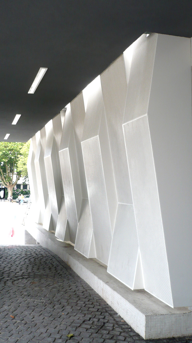
 

کدخدا

مدیر بازنشسته
Defining responsive architecture...

Defining responsive architecture...

Defining responsive architecture...
WAN House of Year competition brings out strongest design talents

Last year, Marbach made its architectural ascent in status when the city’s Museum of Modern Literature, designed by David Chipperfield to reconnect Germany’s literature once separated by the East/West divide, won the Sterling Prize – a most coveted architecture award. This year, perched on 6900 m2 of land atop a hill facing the museum, a private house responds with originality and thoughtful design, elevating the bar in the region.​

Submitted for WAN’s House of the Year 2008, Dupli Casa displays sophisticated shape manipulation to transform a simplistic design into a complex yet comprehensible super-home.​
“The geometry of the building is based on the footprint of the house that previously was located on the site,” say Dupli Casa’s designers J. Mayer H. Architects. “Originally built in 1984 and with many extensions and modifications since then, the new building echoes the ‘family archaeology’ by duplication and rotation. Lifted up, it creates a semi-public space on ground level between two layers of discretion."
The design therefore reflects a family vernacular – the different levels of a family presenting as twisted versions of the next, performing different functions but communicating as a whole.
"The skin of the villa performs a sophisticated connection between inside and outside and offers spectacular views onto the old town of Marbach and the German national literature archive on the other side of the Neckar valley," the architects explain. In such close proximity to Chipperfield’s masterpiece Dupli Casa’s design is able to feature the Museum of Modern Literature as an asset in its own design, responding to the simple lines and blanched colouring.
And just as RIBA, who deliver the annual Sterling Prize, commended Chipperfield for his “control and discrimination in the choice of materials” the same could be saluted in Dupli Casa’s design. Concrete walls and wooden floors are used creating a connection between the modern and the old, the natural and the man-made and the inside and outside, similarly achieved in Chipperfield's columned design which integrates the indoors and out. While the three storey house holds a standing of its own, as a piece defining responsive architecture, its stature grows to reflect this.


کدخدا

مدیر بازنشسته
Hybrid plaza as soothing urban space

Hybrid plaza as soothing urban space

Hybrid plaza as soothing urban space
A contemporary "square" linking buildings and people in extreme hot climates

The Emerald Plaza project for the city of Abu Dhabi deals with the problem of urban space in a very hot environment in artificial, context-less developments in the Middle East and elsewhere.​
Emergent Architecture’s Emerald Plaza design aims to create continuity between the three key elements specified in the brief: a garden, a central sculptural volume, and a network of canopies. At the macro scale, the project is a linking element between three high-rise buildings design by others. Ispired by the souks of Northern Africa as a model for creating interiority and passive cooling as an alternative to open, western public spaces, the canopies merge into a landscaped roof which provides shade for walkways below. This roof also connects the perimeter high-rise buildings together, creating a bi-level entryway into each.​
In an environment where people often avoid the outdoors during daytime hours, this project offers a spatial and atmospheric solution; pools in the plaza underneath the roof have a cooling effect, both evaporative and psychological. During the day, when temperatures can reach 120 degrees Fahrenheit, this involuted, grotto-like space becomes an inviting sanctuary.
Emergent’s investigation into surface-to-strand geometries lead to the conclusion that hybrid, transformative geometries offer a wider range of flexibility than surface, strand, or volume systems alone. Following this principle the surface of the roof transforms into a volume at the center of the plaza. The resulting space becomes a conference and media center, available to all three buildings.


کدخدا

مدیر بازنشسته
ShowCase: John Lewis Department Store and Cineplex

ShowCase: John Lewis Department Store and Cineplex


ShowCase: John Lewis Department Store and Cineplex
Oct 20, 2008

ShowCase is an on-going feature series on Archinect, presenting exciting new work from designers representing all creative fields and all geographies.

We are always accepting nominations for upcoming ShowCase features - if you would like to suggest a project, please send us a message.


Commissioned within a larger city centre regeneration scheme, the John Lewis department store and Cineplex challenge the conventional blank envelopes which typify these buildings and explore ways for them to connect to an urban context.

John Lewis Department Store and Cineplex (Photo: Helene Binet)

John Lewis
The department store skin has been designed as a 'net curtain' – a patterned fabric which permits interior arrangements to be changed without creating exterior clutter yet providing views and natural light to the interiors. FOA's pattern design, which resonates with Leicester's rich textile heritage and John Lewis's own tradition of producing quality fabrics, is formed of four panels of varying density which meet seamlessly across the envelope, transmitting a fabric affect. Frit in mirror onto two layers of glass curtain wall, the mirrored pattern reflects its context and in doing so, densifies and changes as the sun moves around the building. Viewed frontally from the retail floors, the double façade aligns to allow views out, whilst an oblique view from street level displaces the two patterns and creates a moiré effect, reducing visibility and maximizing privacy performance, and increasing visual complexity. The resulting envelope is a translucent and reflective 'net curtain' via which the interior and exterior engage with the context in varying ways.

John Lewis Department Store: Entrance (Photo: Satoru Mishima)

John Lewis Department Store: Entrance (Photo: Satoru Mishima)

John Lewis Department Store: Façade Detail (Photo: Lube Saveski)

John Lewis Department Store: Interior (Photo: FOA)

Cineplex
The Cineplex needs to be a sealed box, detached from natural light. This part of the building is enveloped in an opaque stainless steel mirror finish rain screen, with pleats along the perimeter introducing intricacy to the enclosure. It is clad in 10,300 small, steel shingles whose thinness transmits a quilted affect and varies and localizes surface reflections. The pleats, shingles and mirror finish provide shadow, texture and color, while the play of light on the surface creates continuously shifting patterns. The opaque envelope is therefore transformed to a 'theatrical curtain' whose performance is relative to its exterior.

The Cineplex - Street View (Photo: FOA)

The Cineplex - Street View (Photo: Satoru Mishima)

The Cineplex - Façade Detail (Photo: Helene Binet)


Foreign Office Architects (FOA)

Foreign Office Architects (FOA) was founded in 1995 and has emerged as one of the most innovative practices of architecture and urban design in recent years, known for combining technical innovation with design excellence. FOA's award-winning projects include the Yokohama International Cruise Terminal in Japan, noted for its use of dramatic form, innovative materials, and fascination with the interplay of architecture, landscape, and nature, credited by the Design Museum as a "design sensation alive with bustling urbanity and seaside tranquility". Other award winning projects include the Spanish Pavilion at the Aichi International Expo in Japan; the South-East Coastal Park in Barcelona, Catalonia; the Torrevieja Municipal Theatre and Auditorium, the Technology Centre in Logrono, and the Carabanchel Social Housing in Madrid, Spain; the Highcross development anchor building in Leicester, UK; the Meydan Retail Centre in Istanbul, Turkey; and the Dulnyouk Publishing Headquarters in Paju, South Korea.

FOA's current projects in the UK include Ravensbourne College of Art and Communication in Greenwich, Trinity EC3 office complex in the City of London, two large retail-led schemes in Southampton and Sheffield; the redevelopment of Euston Station and a new Maggie's Centre in Newcastle; in Spain FOA is building the Institute of Legal Medicine in Madrid; in Catalonia, an office complex in Barcelona; in France, Residences for Artists and Researchers in Paris and a large office complex in Toulouse; in the USA, a Museum of Contemporary Art in Cleveland as well as several high-rise residential towers in Korea and Malaysia.

The work of FOA has been widely published and exhibited, and represented Britain at the 8th Venice Architecture Biennale in 2002; the firm has received the Enric Miralles Prize for Architecture, four RIBA World Wide Awards, the 2004 Venice Architecture Biennale Award, and the Charles Jencks Award for Architecture.

Partners
Farshid Moussavi is an architect and educator, and co-founder of Foreign Office Architects (FOA). Since 2006, Farshid Moussavi has been Professor in Practice of Architecture without limit of time at Harvard University. She was trained at Harvard's Graduate School of Design, University College London, and Dundeen University. She has taught at the Academy of Fine Arts in Vienna where she acted as Head of the Architecture Institute, the Architectural Association, the Berlage Institute, and the Hoger Architecture Institute, and in the United States at Harvard, Columbia, and Princeton Universities, and at the University of California at Los Angeles. She has published "The Function of Ornament" in 2006, based on her research and teaching at Harvard.

Professor Moussavi serves as member of design and architecture advisory groups for the British Council and for the Mayor of London's "Design for London" imitative, and previously for the London Development Agency, the RIBA Gold and Presidential Medals, and the Stirling Prize for Architecture. In 2004, she was Chair of Master Jury of the Aga Khan Award for Architecture: since 2005, she has been a member of the Award's Steering Committee.

Alejandro Zaera-Polo is a founding partner of Foreign Office Architects together with Farshid Moussavi, and occupies currently the Berlage Chair in the Technical University of Delft, the Netherlands. Prior to this current role at the TU in Delft, he has been for four years the Dean of the Berlage Institute in Rotterdam, until 2005. Previously he has been also Unit Master at the Architectural Association School of Architecture, and a Visiting Professor at the University of California in L.A., Columbia University in New York, Princeton University, the School Architecture in Madrid and the Yokohama School of Architecture where he currently has an advisory role. He has also been an advisor to several committees, such as the Quality Commission for Architecture in Barcelona City and the advisory Committee for Urban Development of the City of Madrid and is a member of the Urban Age Think Tank of the London School of Economics.

He has published extensively as a critic in professional magazines worldwide, El Croquis, Quaderns, A+U, Arch+ and Harvard Design Magazine amongst them, and contributed to numerous publications, such as The Endless City curated by Ricky Burdett and Dejan Sudjic.


کدخدا

مدیر بازنشسته
Holcim Awards Winners for North America Announced in Montreal

Holcim Awards Winners for North America Announced in Montreal

Holcim Awards Winners for North America Announced in Montreal
Posted: Monday, October 20, 2008

Montreal / Canada – October 16, 2008 – The winners of the second North American Holcim Awards competition for Sustainable Construction projects were announced at a ceremony in Montreal. Total prize money of USD 270,000 was presented to nine projects from Canada and the United States that showcase the latest approaches to address critical topics including housing affordability, employment, renewable energy, and water efficiency.
The competition is run in parallel in five regions of the world by the Swiss-based Holcim Foundation for Sustainable Construction. Almost 5000 projects from 90 countries entered the competition which aims to promote sustainable responses from the building and construction industry to technological, environmental, socioeconomic and cultural issues.
Gold Award to New York City's first carbon-neutral building
The Solar 2 Green Energy, Arts and Education Center will be the first building in New York to produce all the energy the building needs from sustainable sources. The project received the top prize of USD 100,000 and the Holcim Awards Gold 2008 trophy for North America. Praised as a symbol of the city's commitment to energy independence and environmental sustainability, the project led by Christopher J Collins will be constructed on a "brownfield" waterfront site in downtown Manhattan.

Gold: Solar 2 Green Energy, Arts and Education Center, New York, USA: front entry, café and stage.

Gold: Solar 2: building organization.

Gold: Light, ventilation and electricity.
Head of Jury and Dean of the Massachusetts Institute of Technology (MIT) School of Architecture and Planning, Adèle Naudé Santos, commented that the project will feature innovations that can be applied in homes and other buildings, and motivate visitors to consider how they can personally contribute to the solution of today's energy and climate challenges. "This project brings the eco-building vision into reality and shows how 'green' design and sustainable construction can achieve massive energy and environmental savings without forgetting the importance of architecture and aesthetics," she said.
Silver Award for a self-contained day labor station in San Francisco
The Holcim Awards Silver 2008 was awarded to a project that establishes informal stations where day laborers can meet and await work. The innovative project is designed by Liz Obgu of San Francisco-based nonprofit organization Public Architecture. The flexible structures offer shelter, benches, washrooms and a facility to prepare and provide food – creating a sensitive environment for people living on the periphery of society. At the same time, the project addresses health and safety needs and contributes to solving a source of community conflict. Green and recycled materials are used to minimize the environmental footprint and economic cost of each facility.

Silver: Self-contained day labor station, San Francisco, USA: The day labor station provides a specifi c place for day labor gatherings and facilitates the employment process.

Silver: Model view.
Freshwater lake restoration and research facility in Ontario wins Bronze Award
The Living with Lakes Center in northeastern Ontario will be self-sufficient for electricity and heating needs. The project overseen by Laurentian University scientist John Gunn will also house a research center to investigate the restoration of the city of Sudbury's ecosystem with an emphasis on guaranteeing drinking water quality for future generations. The Bronze award-winning project will be built to LEED platinum standards with instrumentation fitted to monitor the effectiveness of an array of technical features and their impact on lake water quality.

Bronze: Living with Lakes Center for freshwater restoration and research, Sudbury, Canada: Living with Lakes Center: main building, watershed restoration building and site on Ramsey Lake, northeastern Ontario, Canada.

Bronze: Aerial view from lake.
Acknowledgement prizes for projects in Toronto, Vancouver and Detroit
Three submissions received Acknowledgement prizes for their innovative approaches to sustainable construction. An urban sustainability education center on the site of an old brickworks by Canadian charity Evergreen led by urban planner David Stonehouse was applauded for its thorough approach to revitalization. The center in Toronto will promote environmental and community health, "brownfield" redevelopment, heritage conservation, sustainable design and public-private partnerships.

Acknowledgement: Evergreen Brick Works heritage site revitalization, Toronto, Canada: Front view: Evergreen Brick Works.
The comprehensive planning of a minimal-impact North Vancouver Outdoor School by local firm Larry McFarland Architects was recognized for its performance in terms of zero net energy and carbon emissions performance. The center uses elevated buildings to avoid potential damage from flooding and take advantage of the views of the beautiful surrounding landscape.

Acknowledgement: Minimal-impact North Vancouver Outdoor School, Canada: Micro-hydro, wind, solar and ground-source systems provide all the building's energy, and become part of the school's educational program.
A strategy to augment honeybee populations in Detroit by architect Stéphane Orsolini and engineer Erika Mayr of Berlin, Germany was praised for transforming open urban spaces into green parks that provide buffer zones between industrial and residential precincts. The integration of beehives creates employment and also pollination services for the important Michigan fruit and vegetable production sector.

Strategy for environmentally- friendly integration of beehives, Detroit, USA: Bee foraging: the economics of energy consumption.
"Next Generation" prizes for project visions
For the first time, the Holcim Awards competition included a category for the visions of young architects and designers. MIT architect Neri Oxman and University of Michigan engineer John Hart were awarded the "Next Generation" 1st prize for their visionary building skin research using carbon nanotubes to develop materials that can be assigned specific structural, functional and environmental properties.

"Next Generation" 1st prize: Microstructure research for building skins, Cambridge, USA: 3-D printed structurally- and environmentally- differentiated skin demonstrating the polyjet matrix technology.
"Next Generation" 2nd prize was awarded to an urban residential densification project in Toronto, designed by architects Chenlong Wang and Lingchen Liu of Beijing, China. The proposal creates a series of unusual housing designs that perfectly utilize small gaps in the urban fabric.

"Next Generation" 2nd prize: Residential density for urban spaces, Toronto, Canada: Sub-project 8: creeping.
The 3rd prize was awarded to Harvard Graduate School of Design student Andrew Lantz for his proposal for an urban fitness, cultural and housing center that collects energy from kinetics, such as running on a treadmill, to power the structure.

"Next Generation" 3rd prize: Responsive urban downtown activity center, Boston, USA: Section through fi tness center.
Independent jury of international experts in architecture and sustainability
Competition submissions for projects in region North America were evaluated by an independent jury hosted by MIT: Adèle Naudé Santos (Head of Jury, USA), Philippe Arto (Canada), Ray Cole, (Canada), Sarah Graham (USA), Reed Kroloff (USA), Mohsen Mostafavi (USA), Hans-Rudolf Schalcher (Switzerland) , Marion Weiss (USA) and Mark West (Canada) used the "target issues" for sustainable construction developed by the Holcim Foundation to evaluate submissions. The "target issues" address the triple bottom line of economic, environmental, and social factors together with architectural quality and the potential to apply the innovation in other locations.
International series of five ceremonies
The prizes for region North America were conferred at the awards ceremony held at the Montreal Hilton Bonaventure attended by more than 300 representatives of government, business, architecture and related disciplines. Mayor of Saint-Laurent, Alan DeSousa, member of the National Assembly, Russel Copeman, on behalf of the Premier of Quebec, and Chairman of Holcim and of the Advisory Board of the Holcim Foundation, Rolf Soiron welcomed guests. Founding chairman of the World Green Building Council, Kevin Hydes, provided a keynote speech highlighting the pivotal role of the built environment in reducing carbon emissions and redressing other environmental impacts.
The Montreal event was the second of five ceremonies to be held. The results for Europe were celebrated in Madrid, and the results for Latin America, Africa Middle East and Asia Pacific will be announced in the forthcoming weeks. Gold, silver and bronze prize winners from each region automatically qualify for the global Holcim Awards competition. The projects will be further evaluated by a global jury and the winners proclaimed in Switzerland in May 2009.
The Holcim Awards is an international competition of the Holcim Foundation for Sustainable Construction. The competition seeks innovative, future-oriented and tangible sustainable construction projects; offers prize money of USD 2 million per three-year competition cycle; and are run in cooperation with renowned partner universities: Massachusetts Institute of Technology (MIT), USA; Swiss Federal Institute of Technology (ETH Zurich), Switzerland; Tongji University, China; Universidad Iberoamericana, Mexico; and the University of the Witwatersrand, South Africa.
Images: Holcim Foundation

My Best Regards For Ever And For Always
Fantasy is my Architecture\ The Fantasy Become Reality
Arch : M. F. KanFar モハマド


کدخدا

مدیر بازنشسته
NIZIO Design International Win Competition for Museum of Contemporary Art in Wroclaw

NIZIO Design International Win Competition for Museum of Contemporary Art in Wroclaw

NIZIO Design International Win Competition for Museum of Contemporary Art in Wroclaw


Posted: Thursday, October 16, 2008

The city of Wroclaw, Poland, recently announced the winning proposal of an international competition for the architectural design of a contemporary art museum building. The winning team is NIZIO Design International, represented by Miroslaw Nizio (Warsaw, Poland), in collaboration with Konrad Roslak (Nizio Design International) and Damian Cyryl Kotwicki (DCK). Second prize winner is Vicente Guallart Furio (Barcelona, Spain), third winner is Pysall.Ruge Architekten (Berlin, Germany).

1st Prize Winner: NIZIO Design International' s proposal for the Museum of Contemporary Art in Wroclaw, Poland
Further honorable mentions were proposals by Bieniasz - Nicholson Architect(Wroclaw, Poland), M. A. I Domicz - Laboratory of Architecture (Opole, Poland), andLaboratory Architecture Głowacki - Thomas Głowacki.
The Wroclaw Contemporary Museum will house an outstanding collection and will occupy a prime location at the heart of the city's historic Old Town. It aims to serve as an open and dynamic contemporary art ecosystem instead of as a museum in the traditional sense of the word.

Museum Entrance and Façade
Quotes from the winning design's description:
GENERAL DESCRIPTION OF THE FUNCTIONAL AND SPATIAL CONCEPT PROPOSAL
In its theoretical form, the design of the Contemporary Art Museum diffuses between searching for a modern form that is "appurtenant" to the site, and Wroclaw's artistic traditions. Not insignificant role in the design was played by the fields of meaning of Wroclaw-based theoreticians active at the turn of the 1960s-1970s, e.g. "the art of shadow ", „the architecture of matter", or „the light and space relationship" . Based on these nomenclatures, the primary form of the museum's syntax is the square that synchronizes the slightly „abstract" solid geometry. This formally minimized shape ensues from the accurate layout of the building's internal functional space to suit the purposes of the permanent collection, temporary exhibitions, and enriching the museum's collections. The square ideogram combines the concept of the shape and the functional space layout.

Museum Entrance and Façade
DESCRIPTION OF THE SITE DEVELOPMENT CONCEPT PROPOSAL
Apart from Wroclaw's theoretical artistic traditions, the most substantial inspiration for the space organization was the square yard between Frycza Modrzewskiego, Bernardyńska and Purkiniego Streets that enables perfect development of the museum site. The concept of the urban space development has imparted its structure to each story inside the building. . In the neighborhood of the church located just by the museum site, the mass of the building visibly deviates and so it outlines the substantial separation of both structures, concurrently reflecting esteem of the old cathedral. The color of the museum building and its height (the building has been slightly embedded in the ground – 1 meter) were analysed in a comparative process of the structure. Within the space surrounding the Museum integrated have been concrete squares, „cut in" in the ground surface, which squares replicate the existing emblem of the main mass of the museum building. In view of the close proximity of the College of Fine Arts, they constitute fields for spatial public confrontation. Their structural concavities or convexities immersed in stripes of greenery create artistic and workshop activity spaces. The park around the MWW (with its structure retained) creates an insular logical sequence that draws on the space geometry that is filled with the oval Raclawice Panorama, the cubic MWW building, and „scattered" functional sculptures, where the freedom and liberty of spatial organization is one of the key functions of a contemporary museum. The paving of the square that is directly adjacent to the MWW is made from homogenous concrete that smoothly progresses into the dark and uneven façade of the building. The concrete surface, on both sides adjacent to the mass of the building, features strips of stairs that create an inner agora.

Exhibition Space
DESCRIPTION OF THE MUSEUM'S ARCHITECTURAL CONCEPT PROPOSAL, INCLUDING STRUCTURAL AND MATERIAL SOLUTIONS
The study of the „hard" square and its physical deviation (shift) at one point creates an ephemeral mass covered with a systemic stone structure. The cube's structure intentionally is not a monolith. The ferroconcrete structure (50×50m) has been embedded 1 meter in the ground so that the museum can harmonize with the existing buildings in the vicinity. The structure's model is not only a content-related translation of the concept of overlapping squares, but is indicative of the form's dynamics and limitations as well. The cube's base exists both in the plan, structure, and the façade. Both quarts boast logical points of reference. The parallelism to the church and the street is a consequence in keeping the proportion of the cube's "movement". Regular cubic slots in the building's façade, moved away from the solid (1×1m, with the cross-section of 30 cm) are also a translation of practical interdisciplinary nature of the internal and external function of light (darkened top exhibition stories) and an opportunity to fill the space of stone cubes with LCD screens, which may provide a great surface for video art. For the play of the light that permeates through the lit-up holes, or by utilizing the bottom parts of the surface, the museum building becomes an illuminated mass that projects its luminous form onto the nearby park.

Exhibition Space
One important element is the museum's openness to any and all artistic interventions that mark continuous changes in the façade structure. The museum's stories are a logical response to the building's functionalism, where the rooms – relative to the levels – are laid out in conformity to the consistent root idea of them being inscribed within a square. In shaping the interior, the determination to create open and functional exhibition spaces was underscored by figurative repetitiveness of interior surfaces, movable walls in the exhibition zone, and spatial functionality (office spaces outside the square, exhibition spaces inside the square).

Exhibition Space
Vertical communication between the stories plays an important role, e.g. for the „rest zone" that is tastefully located park-wards, and independent staircases (three on each floor), which ensures easy movement of visitors. For its "resonant" nature and pure spatial form, the museum hall integrates the spaces of smaller exhibitions, thus being a harmonic indication of what is to be found on higher stories of the museum. At the entrance to the hall there has been installed a longitudinal screen (of connected LCD screens). This visible projection may serve as a transfer of the visual announcement of temporary exhibitions. In order to consolidate the expanded space of functionally diversified rooms, on each floor there is a multimedia information point. The exhibition and auditorium space, with its modular walls, may be adjusted to the various "thematic contents", from performance through conventional exhibitions.

Exhibition Space
One shift of the structure causes another. This configuration is also retained in the museum's interior. The surface indentation that leads to the building is not restricted with a framework, rather it is a response to the still controversial issue of „public space" that on its own defines social processes, and the museum's accessibility. The bottom of the surface is partly filled with glass, which makes the mass of the building lighter and open to the space of the park. The stone façade on each side gains a different dynamics, is spatially variable relative to the different angles of light incidence. The cross-section through the façade gains in form sharpness for the sharpness of the external edges. The ceilings in the exhibition part are made from suspended parameters that create an adequate mesh of square modules. On the roof of the building there has been repeated the emblem of the square that strictly functionally illuminates the exhibition and conference room, projecting the shadow of the façade structure relative to the movement of the sun. The color contrast plays an important role between the external structure (organic black stone color) and the building's interior. Its whiteness becomes a neutral space, where the viewers' main focus will be on the various forms of art. The bright interior enhances the „mini architecture" (stairs, balustrades) , adequately made from a stone material that twines the outer mass of the museum building.

Floor Plan Street Level
All images by NIZIO Design International

My Best Regards For Ever And For Always
Fantasy is my Architecture\ The Fantasy Become Reality
Arch : M. F. KanFar モハマド
 

کدخدا

مدیر بازنشسته
معرض ميلان_ايطاليا:

معرض ميلان_ايطاليا:

معرض ميلان_ايطاليا:

الموقع:
يتمتع الموقع الجديد للمعرض بالإستراتيجية لكونه قريب جدا من مركزا لمدينة ويقع على طريق مطار مالينا الدولي.

وصف المشروع:

يتضمن المشروع كتلتين بنائيتين، مبنى معرض ميلان القديم في مركز المدينة، والمبنى الجديد في منطقة ريو بيرو من تصميم المعماري Mario Bellini، وتشكل الكتلتين احد اكبر المعارض في العالم على 2,000,000م²، حيث تمثل المساحة المبنية 710م² منها وتمثل مساحة المعرض الجديد 530,000م² من المساحة المبنية.
وقد صمم المبنى الجديد ليسمح بعرض عدة انواع من المعروضات في وقت واحد، ويوفر المعرض التسهيلات للمنظمين والعاملين بالمعارض وكذلك الزائرين والموظفين، إن نظام معرض ميلان الجديد يحول فكرته من الشكل المحلي الاعتيادي إلى المنظور الذي تنطبق علية المقاييس العالمية..

الوصولية للمشروع:
يحيط بالمشروع شبكة من الطرق و التي اعطته تميزا على مستوى المدينة فهناك شارع النفق الذي يمر بالجهة الشرقية للمشروع كما هناك شارع المطار و طريق السكة الحديد طريق سريع. في الجهة الشمالية، و شبكة من الطرق المقترحة التي تربط المعرض بالمناطق المجاورة.


عناصر المشروع:
يشتمل المعرض الجديد على مجموعة واسعة من الخدمات مثل الأسواق التجارية والمقاهي والبارات والاستراحات والمطاعم ومراكز الاستجمام، كما يضم المشروع 3 فنادق، وكذلك يضم المشروع 80 غرفة للمؤتمرات بالإضافة إلى مجموعة واسعة من الخدمات التكميلية والتي تحتل مساحة تقارب60,000م²، والتي أصبحت جزء هام من المناطق المحيطة بالمعرض والتي تساعد على الاستثمار المالي فيه

1.المداخل:
يضم المشروع ثلاثة مداخل رئيسية احداها في الجهة الشرقية، والذي يعتبر من أهمها نظرا لكثافة الزوار من ذلك المدخل، حيث يطل هذا المدخل على أهم الطرق المحيطة بالمشروع، كما يميز كتلة المدخل كتلة مميزة ذات شكل انسيابي مصنوعة من هيكل معدني ومكسور بالزجاج، ومدخل آخر في الجهة الجنوبية واخر في الجهة الغربية كما توجد مداخل اخرى ثانوية للمشروع.


2.المحاور:
المحور الرئيسي للمشروع يمتد من الشرق للغرب بطول 1.3كم وينتهي كل طرف بمدخل رئيسي للمشروع كما توجد هناك محاور ثانوية عمودية على المحور الرئيسي و تؤدي لصالات العرض

3.صالات العرض:
يتألف المعرض من 8 أجنحة للعرض موزعة بشكل مصفوفات متناظرة، حيث يوجد الصالات الوسطية في المنطقة الشمالية على مستويين وتقسم كل من صالات العرض إلى عشرين جناح، ويربط الصالات ممر المشاة المركزي بارتفاع 6 متر عن الأرض.
كما يضم المعرض ساحات العرض الخارجية المكشوفة والتي تمثل مساحة 60,000م².


الأسلوب الإنشائي:
صمم ليسمح بإقامة العديد من العروض في نفس الوقت،وقد تم استخدام الصفائح المعدنية في تغطية صالات العرض، أما بالنسبة لمحور المشاة الرئيسي الذي يربط المشروع فلقد استخدم الهيكل المعدني المغطى بالصفائح الزجاجية انسيابية الشكل و المتساقطة بين أجنحة العرض للأسفل بين الفراغات مجسداً فكرته في انسياب المياه من مصدرها..


کدخدا

مدیر بازنشسته
Abu Dhabi Sky Bridge Hotel


Total Area: 110,000m²
Number of Rooms: 264 (80-100m²)
Number of Suites: 40 (250m²)
Conference Area: 5,000m²
Commercial Area: 3,500m²
Restaurants: 2,600m²
Lobby: 4,250m² (108,000m³ volume)
Roof Garden: 5,400m²
Pedestrian Promenade: 11,200m²
Parking Area : 40,000m² x 2
(800 cars
x2- 200 per floor)


کدخدا

مدیر بازنشسته
COR Miami, Florida

COR Miami, Florida

Oppenheim
architecture + design
COR
Miami, Florida
A dynamic synergy between architecture, structural engineering, and ecology.


Oppenheim architecture + design recently won unanimous approval for COR, a Green building in Miami’s Design District.
The building produces its own energy, using alternative technologies, and employs a wide variety of cost-effective design strategies.
COR extracts power from its environment by utilizing the latest developments in wind turbines, photovoltaic panels, and solar hot water generation. A hyper-efficient exoskeleton shell simultaneously provides building structure, thermal mass for insulation, shading for natural cooking, enclosure for terraces, armatures for turbines, and loggias for congregating on the ground.


The industrial-inspired interior spaces are rooted in functionality and flexibility. Versatile, light-filled interiors and high-tech building infrastructure establish a unique balance between sleek professional spaces and comfortable residential spaces.
Restaurants and retailers on the ground floor will add to COR’s urbanist personality allowing the building to engage the street and create a dynamic venue for pedestrian interaction.


The project is a collaboration between Chad Oppenheim, engineer Ysrael Seinuk, and energy consultants Buro Happold.
Total height: 400 feet
The building will break ground in 2007.
 

کدخدا

مدیر بازنشسته
Hadid's island paradise

Hadid's island paradise

Hadid's island paradise


Star architects on board for private island resort

Exclusive enclaves of modern and experimental luxury residences designed by star architects for the “well-heeled” are cropping up everywhere. New York has Sagaponac. The Cotswolds has the Lower Mill Estate. And now there is Dellis Cay.​
Dellis Cay is the vision Dr. Kinay, Chairman and CEO of the international real estate development group, the O Property Collection. Kinay purchased a 560 acre island that is part of Turks and Caicos archipelago and hired seven world renowned architects to create what is being billed as “the worlds rarest living experience in a limited collection of private residences and villas.​
On board for the project are Shigeru Ban, David Chipperfield, Carl Ettensperger, Zaha Hadid, Kengo Kuma, Piero Lissoni and Chad Oppenheim. In addition to the 124 villas and 154 residences, the island will have a 30,000 sq ft Spa operated by the Mandarin Oriental, a five star luxury hotel, a signature restaurant and numerous casual dining experiences.​
The entire development is being master planned by Zaha Hadid, who also has designed some of the island’s residences, villas, restaurants, boutiques and the marina.​
Residences will range from $2 million to $20 million. The development broke ground in January and is slated for completion at the end of 2009.​
 

کدخدا

مدیر بازنشسته
Menzis office building / Cie

Menzis office building / Cie

Menzis office building / Cie


Architects: Branimir Medic & Pero Puljiz, de Architekten Cie
Location: Groningen, Netherlands
Project Team: V. Ulrich, M. de Jong, K. de Schepper, C. Garcia, W. Benschop, M. Keijzer, P. van Berkum, H.O. VermeerConstruction Year: 2003-2005
Contractor: Heijmans IBC bouw bv, Assen
Structural Engineer: Ingenieursbureau Wassenaar bv, HarenConstructed Area: 20,000 sqmPhotographs: Allard van der Hoek, Christian Richters, Luuk Kramer


The new construction for the Menzis health insurarce company is situated on the edge of the Europapark urban expansion of the city of Groningen. At city scale level, the construction expresses its iconographic character toward the urban circular and the A7 motorway, the Europaweg. At ground floor level, the street alignment is determinated by the Europapark, where the building, as it rises, gradually leans over into the street space.
The 12-storey building is divided into three identical prismatic segments, rotatred 90º in relation to each other. With dimensions of 43 x 43 m, the segment is characterized by functional yet aesthetic compactness. Each segment contains four storeys, intersected vertically by an atrium. As a consequence, a spiral of atria is generated, forming an internal response to the dynamic exterior.
The foot accommodates the public functions, which are orientated toward the atrium and include service desks, an insurance shop and a healthcare service center. A doctor’s room and several consulting rooms are situated in themore private area. A practical system of partitioning divides the third and fourth floors into meeting rooms, a library, training areas, an auditorium, and a restaurant. The restaurant area can also be deployed flexibly as extra meeting space if required. The spacious staircase, which allow easy public flow though the atrium to the restaurant and meeting centre above, offer an unimpeded view of both the inner area and the water of the Winschoterdiep (canal).
The middle and upper segments are generic. The specific presence of the atrium, which allows the incidence of daylight into the building, contrasts with the neutral character of each storey. The atrium divides each storey into a series of working areas with distinct qualities: peripheral or secluded, light or well-shaded, open or closed. The variation in spatial conditions enables the application of diverse office concepts, geared to the different work processes within Menzis, such as the call center, administrative functions, and stuff functions. The atrium stairs facilitate informal contact between the floors. In combination with the use of natural materials, the magnolia garden around the building with its diverse terraces, water features and illuminations, contributes to creating a pleasant and relaxed ambience.


site plan​
plan 01​

plan 02​
plan 03​
plan 04​

plan 05​
plan 06​
section 01​

section 02​
section 03​
 

کدخدا

مدیر بازنشسته
Vila de Conde Hospital Pediatric Wing / 100 Planos Arquitectura

Vila de Conde Hospital Pediatric Wing / 100 Planos Arquitectura

Vila de Conde Hospital Pediatric Wing / 100 Planos Arquitectura


Architects: 100 Planos Arquitectura
Location: Póvoa de Varzim, Portugal
Client: The Portuguese Heath Ministry
Engineering: ASL&Associados L.da
Contractor: MonteAdriano SGPS
Design Year: 2004-2007
Construction Year: 2007-2008
Photographer: Pedro Serapicos

“The hospital was a hospital like any other in a big city. It had a sinister look, bleak, repulsive, of things that are done by necessity, an obligation … Inside didn’t fit the generous impulse of the heart, but the technique, science, the regulation.”
Domingos Monteiro - Tales and Drama, Vol, 1943

The text above was the starting point of this project.
We were asked to build a pediatric wing on a very damaged XIX century hospital.
The idea was to create a building that didn’t look like a hospital, where children and adults feld as if they were at home. An emotional, simple and non clinic, yet efficient space, were blue a white domain, under the doctors colorful closes.
The interior space is organized by tow parallel corridors perforated by skylights, that bring the Atlantic sun inside, and create constant changes on the interior.
The exterior tries to resolve the volumetric relations with the preexisting building, creating a big frame, that holds a playful metal white facade.
The rest just happens in a very free way, just expecting people feel a little bit better, inside…


floor plan​
east elevation​
north elevation​


کدخدا

مدیر بازنشسته
Capital Hill Residence by Zaha Hadid Architects

Capital Hill Residence by Zaha Hadid Architects

Capital Hill Residence by Zaha Hadid Architects


August 17th, 2008

Here are new images of Capital Hill Residence, a private house in Barvikha Forest close to Moscow, Russia by Zaha Hadid Architects.

The project, which is currently under construction, will be shown in the Russia Pavilion at the Venice Architecture Biennale from 12 September - 23 November as part of a showcase of work by Russian and foreign architects working in Russia.

See our previous story for more information about the house.

Capital Hill Residence is due for completion in 2010.


Credits - current execution stage
Project architect: Helmut Kinzler
Project designer: Daniel Fiser
Project team:
Anat Stern
Daniel Santos
Thomas Sonder


My Best Regards For Ever And For Always
Fantasy is my Architecture\ The Fantasy Become Reality
Arch : M. F. KanFar 
 

کدخدا

مدیر بازنشسته
Ordos villa by Estudio Barozzi Veiga

Ordos villa by Estudio Barozzi Veiga

Ordos villa by Estudio Barozzi Veiga


Spanish architects Estudio Barozzi Veiga have designed a house for Inner Mongolia, China, as part of the Ordos 100 project.

The house is one of 100 private residences, all designed by different architects selected by Herzog & de Meuron for the Ordos 100 project, which is masterplanned by artist Ai Wei Wei.

EBV’s design aims to “create a space that absorbs and intensifies the character of the place and the surrounding elements.”

The following information is from Estudio Barozzi Veiga:

Private Villa
Ordos, Inner Mongolia, China
Private commission
It was our challenge in this project to find an original architectural expression for the program, which is compatible with the beauty of the site and the cinematologic elements.

Our proposal intends to translate this idea of essence and pureness present in the context, in the composition of the project. It will create a space that absorbs and intensifies the character of the place and the surrounding elements.

In contrast with the rough open space of the surrounding. The plan of the house is a pure form, a perfect square. The building appears like a monolithic cube, raised from the earth as an archaic stone. This sensible and pure building is defined by two essential elements: a glazed patio and an expressive roof.

This patio refers to the traditional Chinese houses, organised around a patio. At the same time, it allows the house to change its inner climate from winter to summer and offers the possibility to create a complex interior world with different visual and spatial relations.

The roof defines the house as the solidification of a traditional nomadic tent, an element that covers, protects and marks the place.

The result is an introverted cube characterised by its expressive roof. In this way, living in the interior is associated with the sensation of being under a tent, a protected skin, an extended sail.


کدخدا

مدیر بازنشسته
Spear goes back to school

Spear goes back to school

Spear goes back to school
Arquitectonica completes revamp of Florida school

The Ransom Everglades School is one South Florida’s oldest and most prestigious private schools. So when the School needed to revamp its physical plant, it called on alumnus, Larurinda Spear, founding principal of Arquitectonica, to develop a multi-phased master plan that would provide the progressive school with a forward thinking design. The final phase of the project, an $8 million, 34,000 square foot multipurpose complex called the community Center which features classrooms, administrative offices and the school’s first gymnasium, is now complete.​
The design represents advanced thinking about education and sustainability says Spear. “For example, the interior can be completely illuminated with sunlight so you don’t have to turn on the lights during the day”, said Spear. The new building is the center of administration leadership for grades 6-8 housing all offices and a student activity center.. It’s a central meeting place for the school. The gymnasium is ample enough to accommodate the entire school. The facility’s design reflects the schools innovative curriculum and emphasis on “discussion-based learning.” For example, all classrooms have smart boards in addition to the classic Harkness tables, where students learn around rectangular or square tables..​
The completion of the new campus center and athletic facility, which includes regulation-sized playing fields, comes on the heels of the opening of the School’s $3 million Braman Family Media Center, also by Arquitectonica, which houses a 4,000 square-foot library and computer research center.​


بالا